The Fall's Top 20 Album Covers (Part 1)

'It's a pain in the arse getting covers sorted out nowadays. In the past I'd just hand them the artwork and say, "Use that!" and they'd go off and knock it out in a day or two. All they've got to do is follow instructions. But it's not as easy as it sounds...'
MES, Renegade
This is a topic that several people have suggested to me over the last couple of years. I've tinkered with it from time to time, but have somehow never got around to finishing it. Having just run out of Monday Playlist themes (and having finished my Wedding Present blog) I thought it was about time I sorted it out. Not for the first time, I am grateful to dannyno for rooting out my factual errors.
Obviously, like all my evaluations, this list is entirely subjective. Also, I am no expert in art or graphic design, so this is simply a ranking based on what looks good to me and how well I feel it matches the contents. Feel free to disagree - as I'm sure you will!
One final thing: I am not only including Slates, but I'm chucking The Remainderer in there as well, giving 33 covers in total. Any complaints about this can be sent via airmail letter to the Outer Hebrides...
Didn't Make The Cut...
I'm going to this in three parts. The next two will cover 11-20 and 1-10; this one is going to look at those who didn't make it into the top twenty. I'm not ranking these, so they're in alphabetical order.
Are You Are Missing Winner (2001)

Although I'm not ranking those that fall outside of my top 20, I know that quite a few Fall fans would have this in last place. A blurred negative image of Smith and his (then) new wife is surrounded by garish splotches of pink and purple and the title lettering looks like a clumsy pastiche of the Star Wars opening credits. It's boldly hideous, yet somehow fitting for such an uneven and frustrating release.
Cerebral Caustic (1995)

Pascal Le Gras had supplied the artwork for the four albums that preceded Cerebral Caustic. This, however, was a marked departure from the bold, colourful, semi-abstract designs of the group's early-90s releases. It's one that Brix (at the time in her second, unhappy stint in the group) hated:
'When I saw the cover art for Cerebral Caustic I was horrified. If that LP isn't the worst Fall album, it definitely has the worst cover art - a screaming skull with a clown nose. When I see it now, the skull clown is Mark. It's prophetic. He looks like a f*cking skull, and he acts like a f*cking clown.'
It's certainly an arresting image - one that feels appropriate for the album's ragged, willfully difficult sound.
Ersatz GB (2011)

The cover of EGB has one of the more interesting stories behind it. The original cover was a collage that came from a single issue of the New York Times (31 July 2011). dannyno's investigation of the final cover found that it included cuttings from Metro, 2 August 2011 and the 3 August edition of the Daily Mail.
It's a bit of a an unfocused, thrown-together mess, which once again could be argued is not a million miles away from what the album sounds like...
Fall Heads Roll (2005)

Another that matches the contents: the sparse simplicity of the design - although not exactly inspiring - rather suits the music's generally direct, unfussy approach. The US version was slightly different:

The Frenz Experiment (1988)

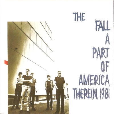
To my mind the group's first misstep in this area. It was the first Fall studio album to feature a group photo: only Light User Syndrome and (to some extent) Your Future Our Clutter would repeat the approach (A Part Of America Therein did feature a decent group shot).
If you look at the original image, it's clear that photographer Paul Cox is not to blame - it's what was done with his picture. Craig Scanlon is brutally cropped; Wolstencroft and Hanley are obliterated by the text; Brix has a capital F sitting right on her face; Marcia fares a little better, elevated above the title, doing her best to smoulder. Smith, however, is in sharp focus, scowling bleakly over the group. As Brix put it:
'We're all partially obscured by the enormous logo, or cropped out. Except Mark, who is grousing in full view above us, lording it over us.'
I Am Kurious Oranj (1988)
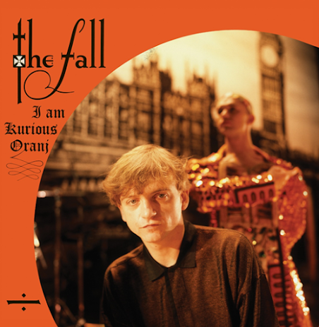
The cover photo was taken by veteran NME photographer Kevin Cummins. It's interesting portrait of MES, capturing him in pensive mood, and looking simultaneously defiant and vulnerable. The blurred background image of Michael Clark provides an intriguing hint of the colourful mayhem of the show (more of which could be seen in Richard Haughton's pictures in the gatefold sleeve - only the the group's second, the first being This Nation's Saving Grace). A good photo, but the sleeve is rather let down by the sub-Blackadder lettering.

The Light User Syndrome (1996)

The group's second attempt at a group photo cover works out more successfully than The Frenz Experiment, in that it all feels a little more equitable (even if Simon Wolstencroft, seems - perhaps appropriately in retrospect - to be being edged out). There's a certain appeal to its dark, sepia moodiness. Nonetheless, it was one that MES himself did not approve of:
The group's second attempt at a group photo cover works out more successfully than The Frenz Experiment, in that it all feels a little more equitable (even if Simon Wolstencroft, seems - perhaps appropriately in retrospect - to be being edged out). There's a certain appeal to its dark, sepia moodiness. Nonetheless, it was one that MES himself did not approve of:
'I look f*cking terrible on Light User - I wasn't eating my greens, and my mouth was wearing whisky perfume.'
New Facts Emerge (2017)

The final album's cover is a fair reflection of its contents. Many of the songs have a brash, enthusiastic tone, and the bold simplicity of Pamela Vander's design echoes the gleeful, don't give a f*ck attitude of tracks like 'O! Zztrrk Man' and 'Groundsboy'.
Reformation Post TLC (2007)

'Sometimes things just fall into your lap, like with Reformation: it was left up to me to sort the cover out, and I had a few images in my mind, but one day I stumbled across this mosaic that a bloke called Mark Kennedy had done for me as a present, and it punched me in the face as the right image to go with. It has a unique religious feel to it. Quite fitting: we’re a faith unto ourselves.'
The UK cover is a great deal better than the US version, another one about which Smith expressed dissatisfaction in his autobiography:
'The cover looks like a poxy school picture, or a prison Polaroid taken for the family back at home by the screws who have loosened up a bit after a couple of Christmas cans.'

This photograph was taken by Bob Gruen, a veteran music photographer who had worked with classic rock acts such as Elton John and Led Zeppelin as well as artists such as The Clash, The Sex Pistols and Blondie. His reputation did not impress MES:
'He took that famous picture of Lennon with his arms crossed... He's done everybody. Sadly, they're all dead or nearly dead... I mean they're good pictures and everything, but his eye has obviously had its day.'
The Remainderer (2013)

Shift-Work (1991)

The first of several covers designed for the group by Pascal Le Gras, a French artist who became a Fall fan from the moment he heard the group on radio (‘I was stupefied and immediately ran to the record shop’). Smith described him as 'a sublime genius', even if he could ‘hardly understand a word he’s saying’.
Sub-Lingual Tablet (2015)

Credited to Ken and Charlie Pearson, about whom I must confess I know nothing. Is it a disco ball? A so-what image and a functional, dull font make this disappointingly mundane.
Your Future Our Clutter (2010)

Another Mark Kennedy design. The group photo collage is pleasingly colourful, although it does make Pete Greenway look a little psychotic. For me, though, it doesn't quite have the right tone, given the themes of fragility and mortality that run through the album. Also, what's with the blank block in the top right corner? Bears a passing resemblance to the cover of The Jam's 1982 album The Gift.


I’ll be interested to hear what you have to say about the Hex and RTL sleeves. And the prog rock-esque cover of LATWT. And will Early Years be included, or is this free of compilations? Let’s face it, album covers were never the Fall’s strong point were they? I wonder if there’s a parallel universe where the Fall were on 4AD with each sleeve a work of art by Vaughan Oliver?
ReplyDeleteJust doing the albums (including Slates) and throwing in The Remainderer to be controversial for now. Might look at singles, comps, live albums at some point in the future though!
Delete