The Fall's Best Single Covers

I did a series of posts a while back about The Fall's album covers and have finally got around to considering the singles. I haven't attempted to rank all of them, just pick my favourite dozen - and I say 'favourite' advisedly, as I have no experience or expertise in art or graphics or anything like that!
With the albums, most of my top ten came from the early part of the group's career (only two were post-Brix's first stint). This is not, of course, a reflection of my taste as far as The Fall's music is concerned - as anyone who's read any of my stuff will know - but perhaps has more to do with the fact that cover art became arguably less important in the CD age. Whatever the reason, it's a pattern that repeats itself here...

Slips (ahem) into the top dozen not because of any exceptional aesthetic merit, but due to the beautifully obvious simplicity of using a photo of an ice hockey team (Blackburn Junior Hawks Under 16s - photographer unknown) for a song called 'Slippy Floor'.
The photo was taken on Fairfax Road in Prestwich (you can see the same scene on the back cover of Grotesque). Paul Hanley pointed out on Twitter that both him and MES are lurking in the picture. The ever-investigative dannyno has also suggested a link a link to 'The Goblin' by MES favourite William Blake.


10 Telephone Thing (1990)
Cornish artist Anthony Frost (whose father Sir Terry Frost was also a noted abstract artist) was one of MES's favourites: Smith described his work as ‘by far the best stuff I’ve ever been submitted’. I've always thought his bold, striking style was a particularly good fit for the crisp sound of Extricate-era Fall.

9 Hit The North (1987)
The artwork of MES's sister Suzanne appeared on Fall releases as far apart as 'Fiery Jack' and Re-Mit. The colourful comic-book style of her 'Hit The North' design was a perfect fit for The Fall's most tongue-in-cheek and danceable single.

8 Oh! Brother (1984)
Claus Castenskiold (who played in bands with both Brix and Marcia Schofield) met MES in 1983, who told him 'Your painting's alright, there cock.' A couple of months later, Rough Trade asked him to design the cover of Perverted By Language. Castenskiold's Munch-inspired grotesque figures were a perfect match for such a darkly intense album; they also served as a strikingly effective contrast to the poppy tone of the group's first Beggars Banquet release...

7 c.r.e.e.p. (1984)
...as was the case with the following single. The titular 'creep' (neither Marc Riley nor Morrissey as many thought) certainly looked suitably gruesome and disturbing.

6 Night of the Humerons (2012)
The Fall's release for 2012's Record Store Day was a 7" with 'Victrola Time' as the A-side. There's lots to love about the cover - the pleasing symmetry of the two figures, the contrast between the monochrome clothing and the garishly psychedelic background - but it's the way that it captures one of Smith's trademark keyboard solos that make it such a winning image.
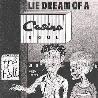
5 Lie Dream of a Casino Soul (1981)
Designed by ‘Savage Pencil’, aka music journalist Edwin Pouncey (who had also got a mention two years earlier on ‘Your Heart Out’), this cover is a perfect match for this serrated stomp through life in a ‘slum canyon’.

4 It's The New Thing (1978)
The Fall's second release (which had an exclamation on the front cover, but not the rear or label) was an exuberantly cynical swipe at the shallowness of the music business (‘phoney advertising quotes that make you buy some / raise your hopes’). The group's self-conscious pose is funny and (especially given how young they look) heart-warming: Yvonne Pawlett and Martin Bramah give it some enthusiasm; Smith and Riley look a little uncomfortable; Karl Burns just seems bemused.

3 Living Too Late (1986)
Smith’s tale of middle-aged regret and ennui (‘sometimes life is like a new bar: plastic seats, beer below par, food with no taste, music grates…’) is a touching, depressing masterpiece. Another of Claus Castenskiold's hauntingly grotesque compositions is a perfect match.

His freakish drawing of a crazed bingo master - not so much restrained as impaled under lock and key - was almost certainly short-lived bassist Jonnie Brown's greatest contribution to the group.

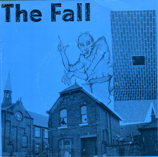
Smith's capacity for vividly conjuring up characters with a concisely crafted lyric was virtually unparalleled, especially in the first half the 80s (arguably the zenith of his lyrical work). Jack is a prime example: Smith described the character (‘I just drink drink drink… I live on pies… my face is slack’) as representing a certain type of Manchester character - ‘hard livers with hard livers; faces like unmade beds’. His sister Suzanne's portrayal Jack as a malevolent drunken tramp who casts a demonic shadow is just perfect.
For my next post, I'm going to look at the very worst of the covers on the multitude of Fall compilations and live albums. If you have any nominations, then please feel free to comment below or via @TheFallinFives or thefallinfives@mail.com


Comments
Post a Comment